
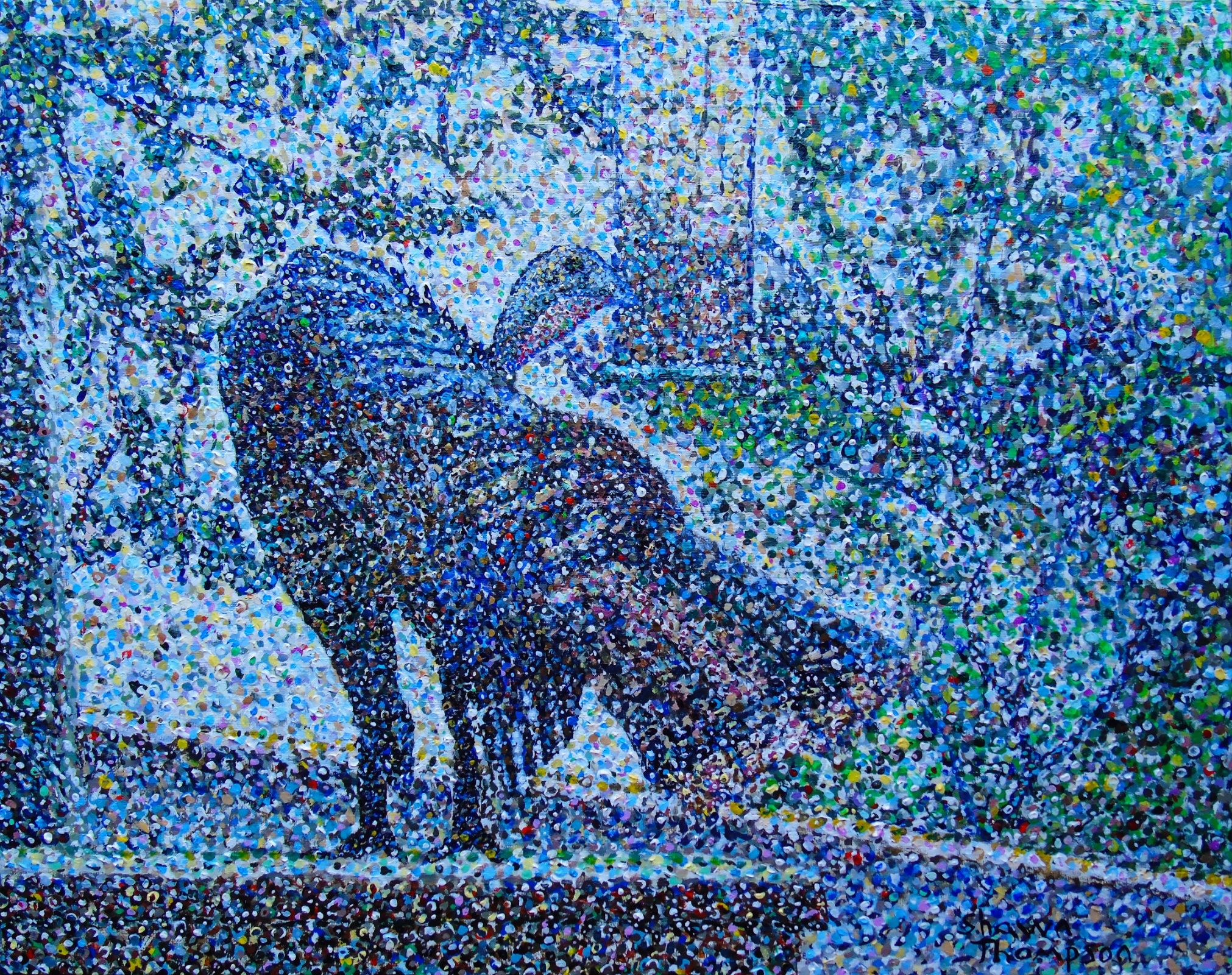
Here is an Acrylic Painting that I created of a Wild Turkey at my bird feeder. This painting was painted from a photo I took in July 2020. Pointillism paintings are extremely challenging because you have to create the tone of the subject by using only dots.
Here is the original photo I used for this painting. I took this photo in July 2020.
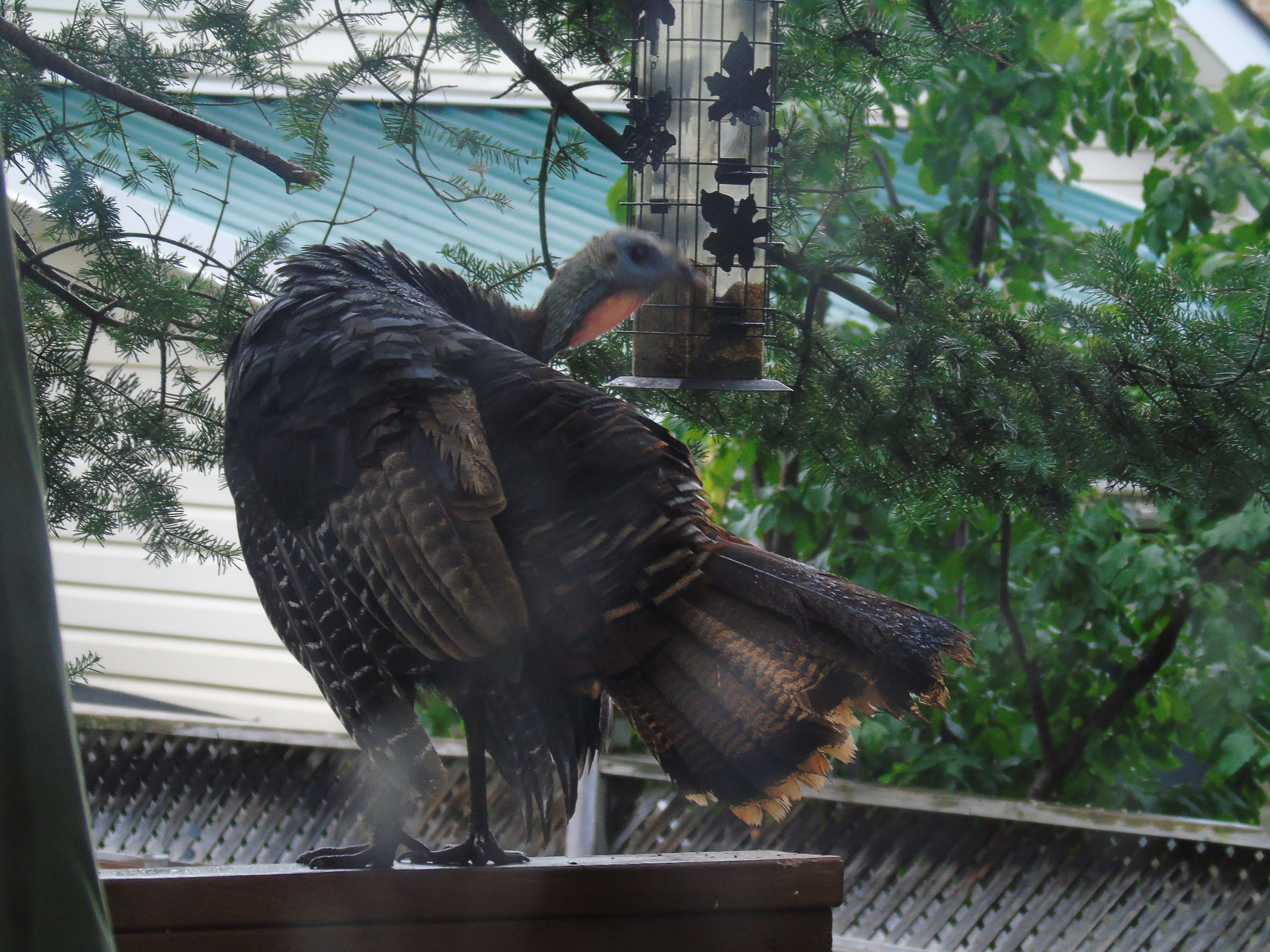
You can see that this photo is a bit blurry and out of focus. What I liked most about this photo is that it shows the tail of the turkey fanned out.
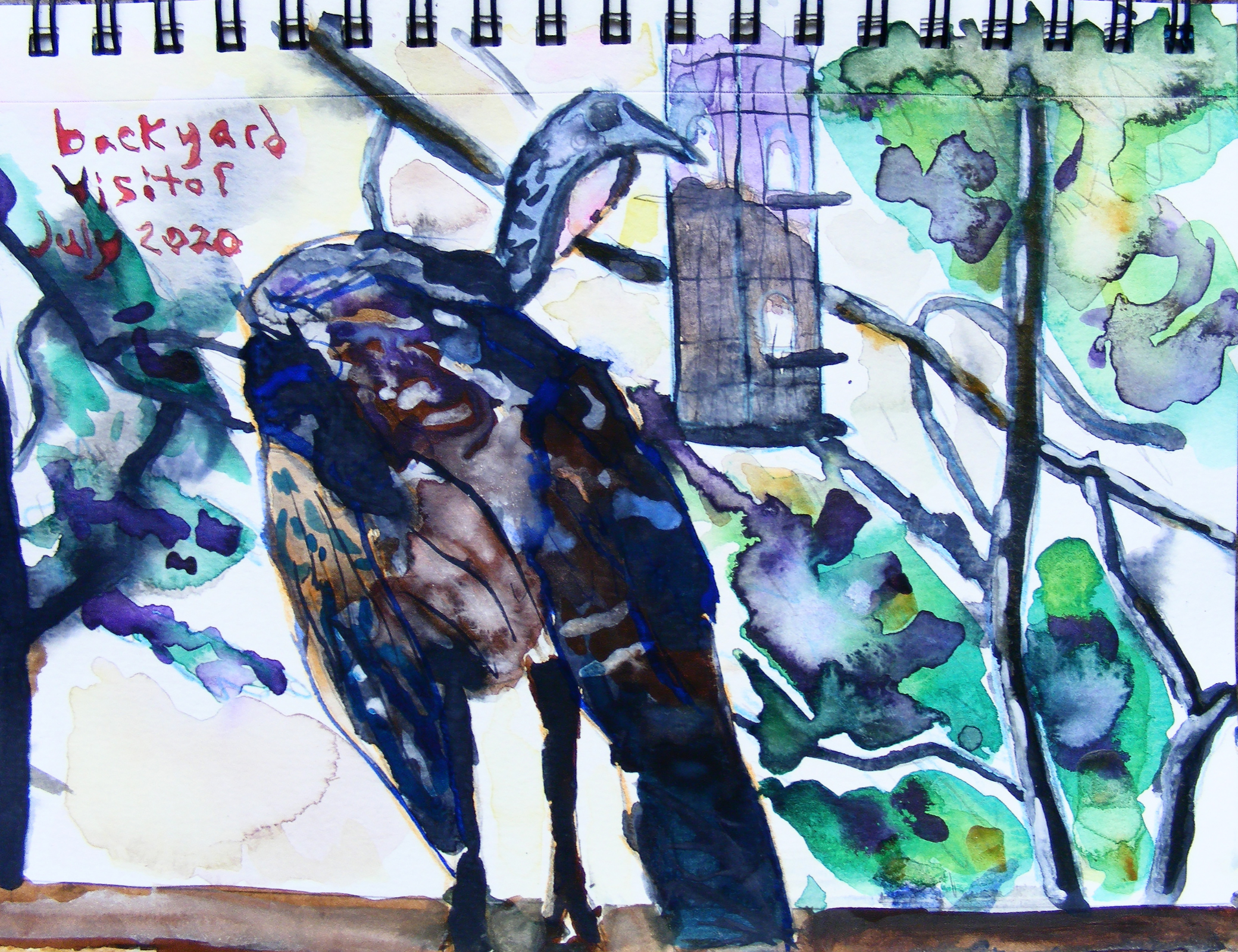
Since this photo was a bit blurry and out of focus, I also used the photo below to get a better sense of the bird.

All my paintings start with a drawing on drawing paper. I then put graphite on the back of the paper with a graphite stick and press it into the canvas with a pencil.
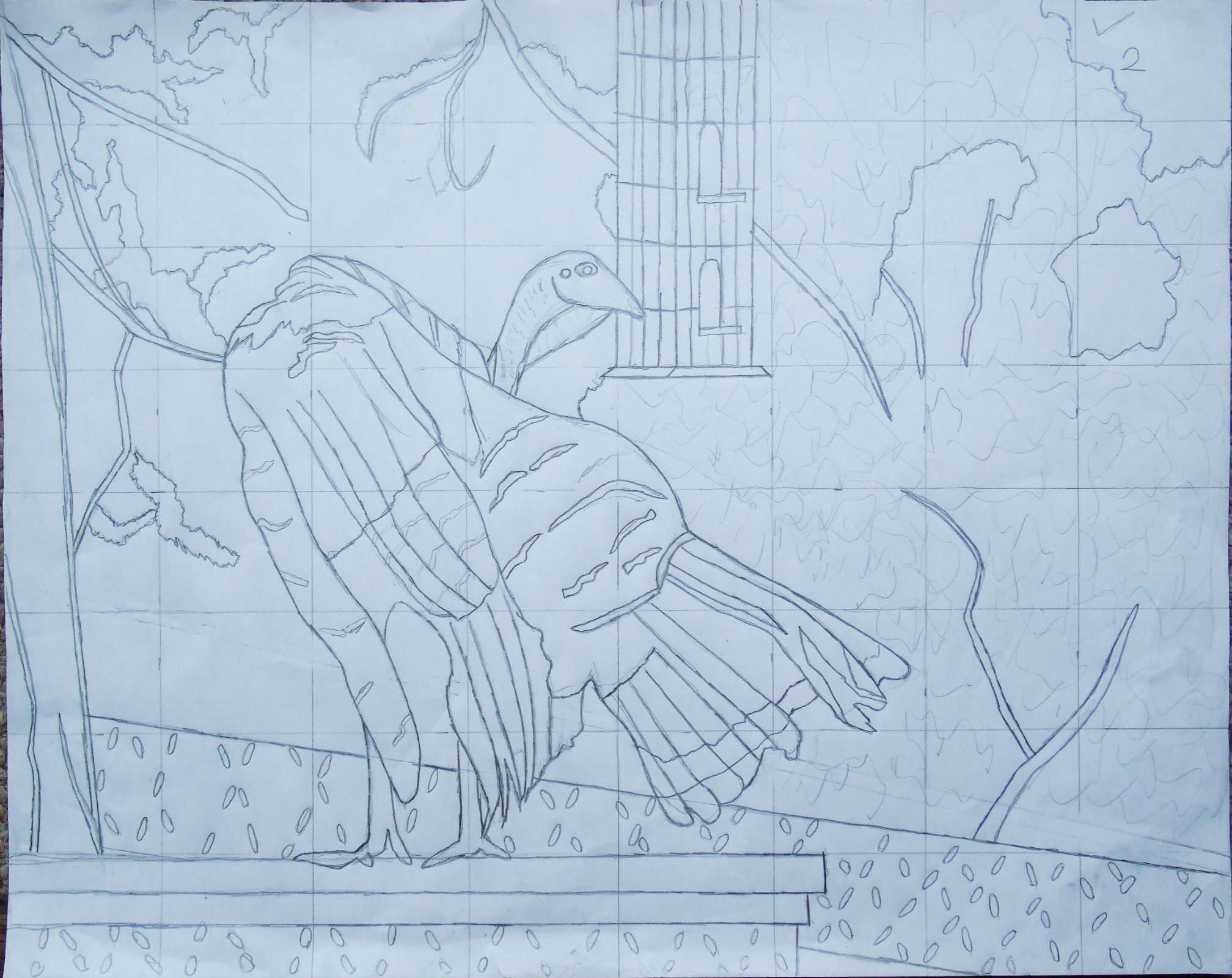
Here is a photo of the original drawing of the painting.
While doing this, I also created a second drawing, and I adapted the strengths of each drawing to improve on each one.
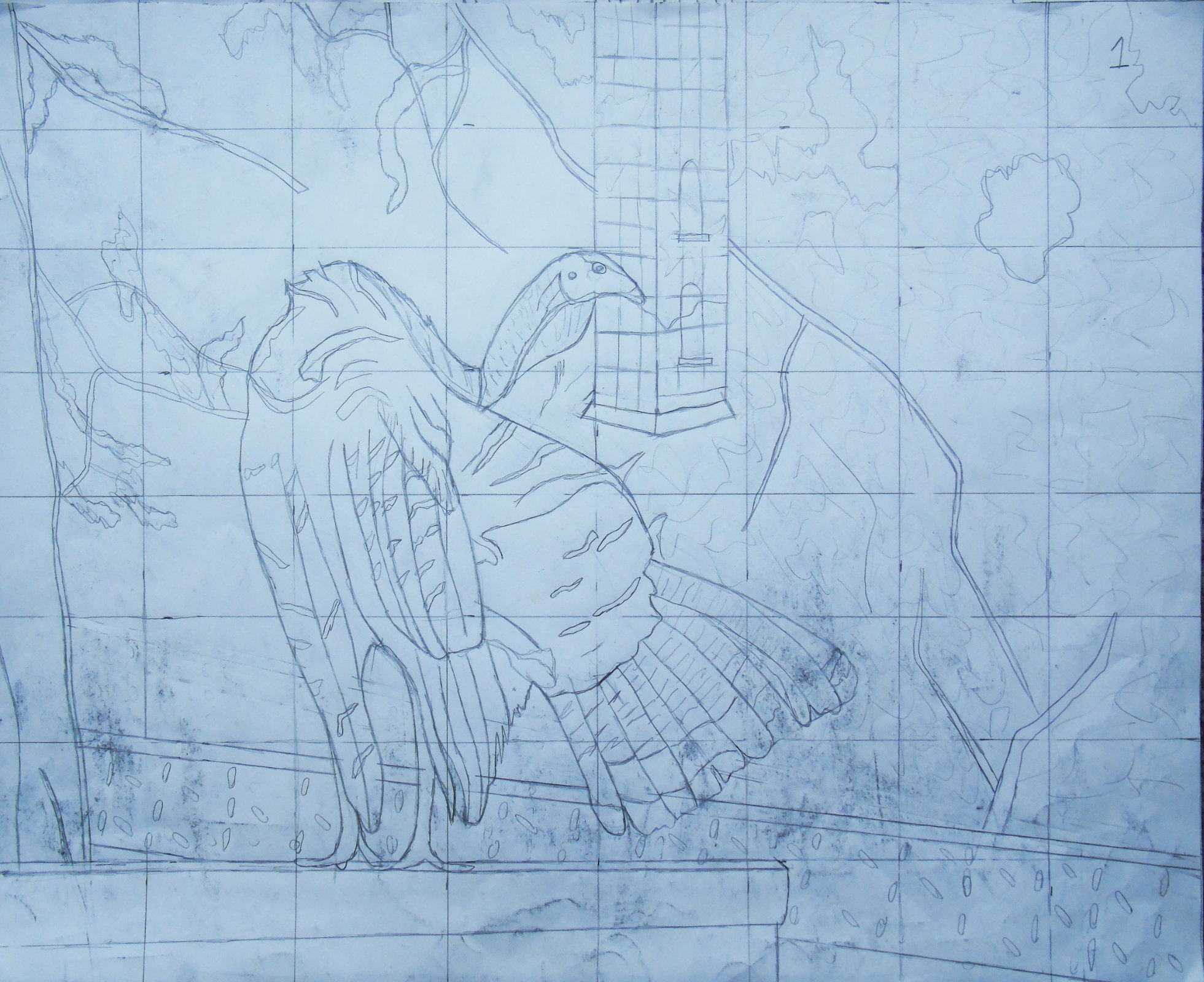
This photo shows the second drawing which I did not use for this painting. I hope you agree with me that the top drawing was the strongest.
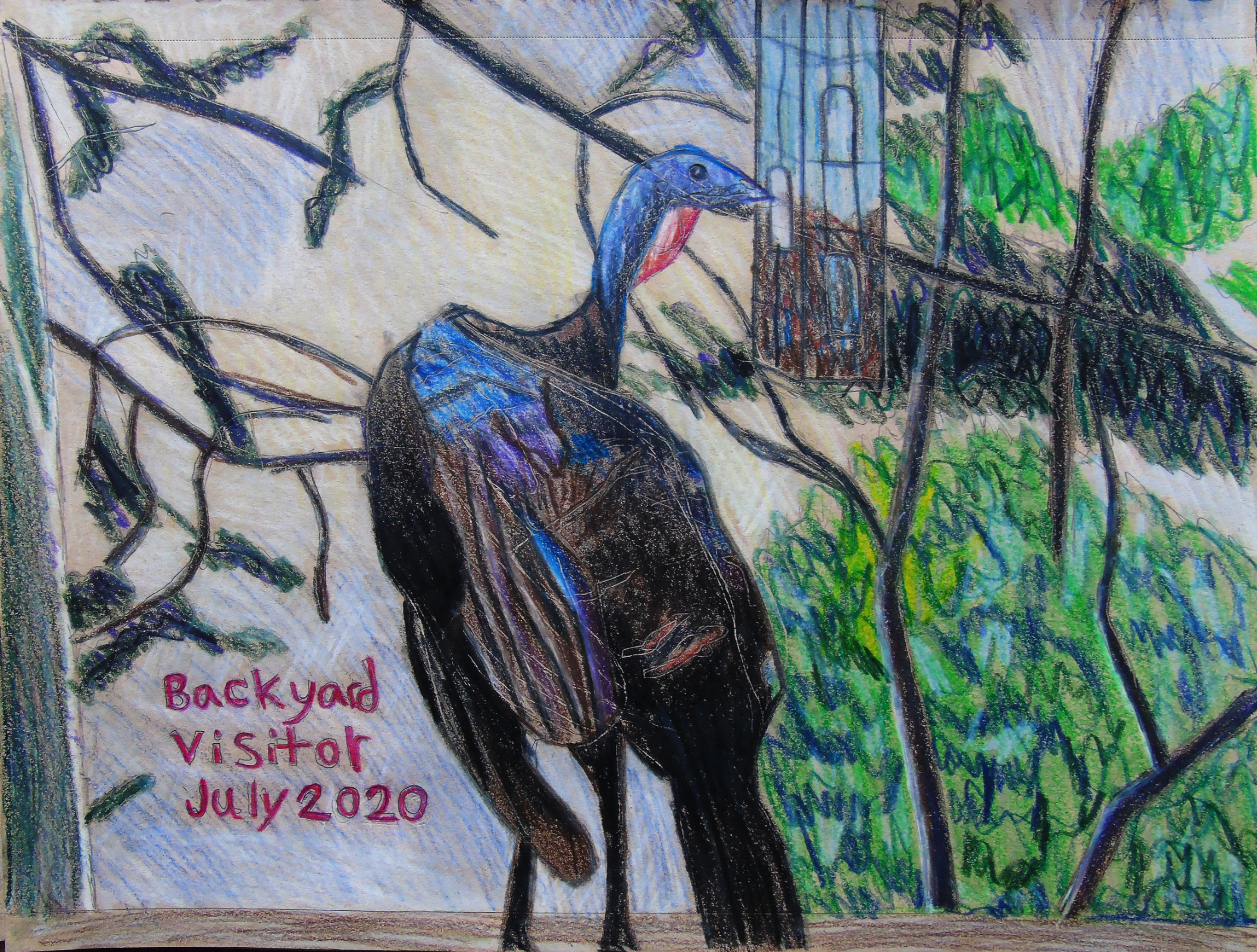
Before I started my Acrylic Painting of the turkey at the bird feeder, I first did some drawings. The first drawing was done in a toned tan sketchbook with Faber Castel Polycromos Pencils. The second drawing was a watercolour drawing in my small 8”x6” watercolour sketchbook.
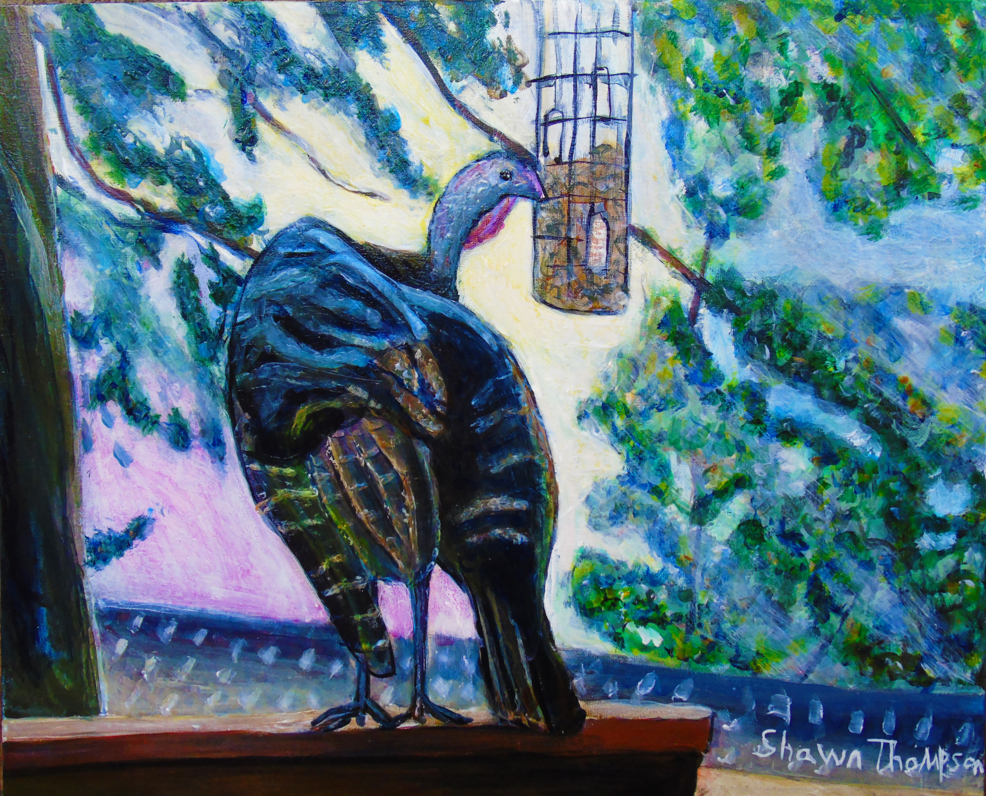
Last year, before I started my Pointillism version of this painting I also created a full tone Acrylic Painting of the Wild Turkey at my Bird Feeder. Both of these paintings are the same size at 20”x16” and these paintings are both on an Apollon heavy-weight gallery canvas with 3 coats of gesso.
Painting Process of “Turkey Pointillism Painting”
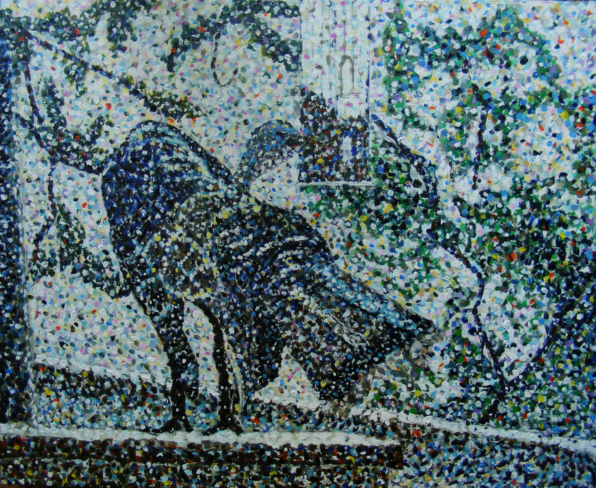
The first photo of the painting was taken after 6 hours of working on this painting, and 6 hours into the painting process.
At this stage, the most important thing is to just bring out the contrast and get a general sense of the tones in the painting. Most of these dots in the painting will be covered up later by countless layers added on top.
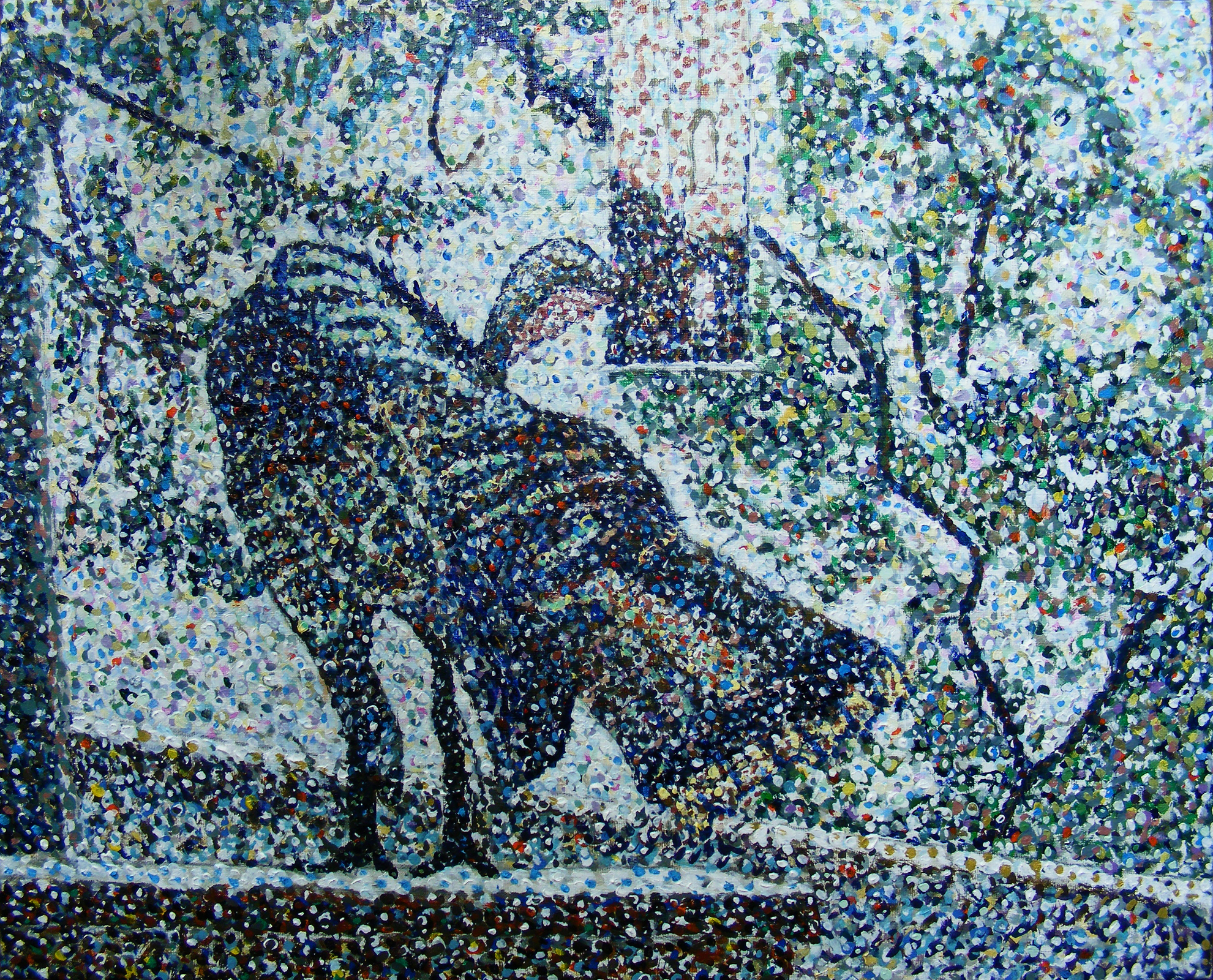
The second photo of the painting was taken after 10 hours in the painting process. At this stage the painting takes on a bit darker appearance, with more variation of tone.
I added a few stipples of Pyrrole Orange to the painting to add effect, and I used a lot of primary colours in the background to bring out the interest.
At this stage of the painting, I added a bit of texture to the feathers on the bird’s back.

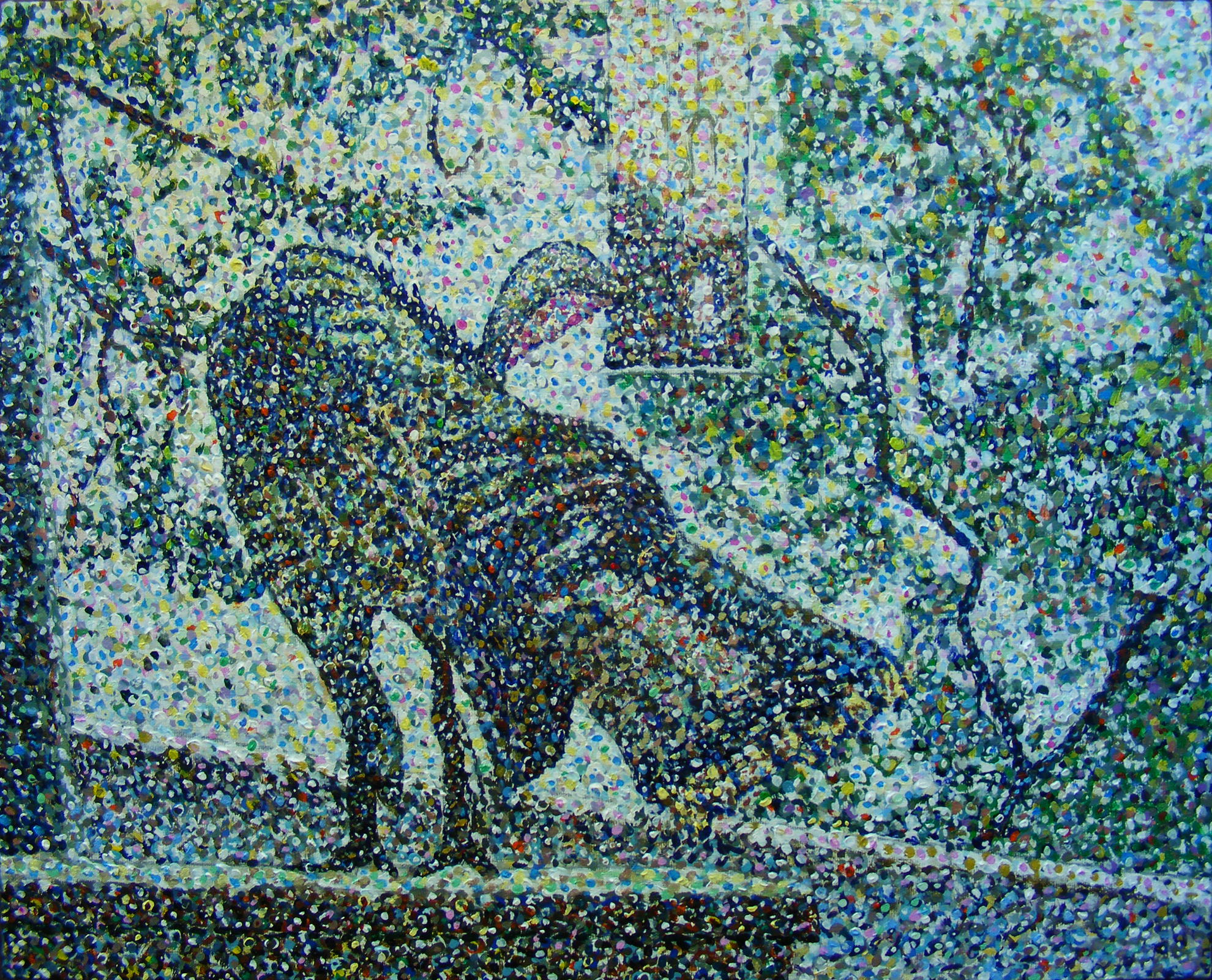
Here is the third progress photo of this painting. This photo was taken 14 hours into the painting process. You can see in this stage I added more variation in tone, and I brought out some more texture in the bird’s feathers.
I took a turn towards neutral colours in this stage and you can see the painting taking shape. A major challenge I had at this point was also bringing out the character and impression of the background trees.
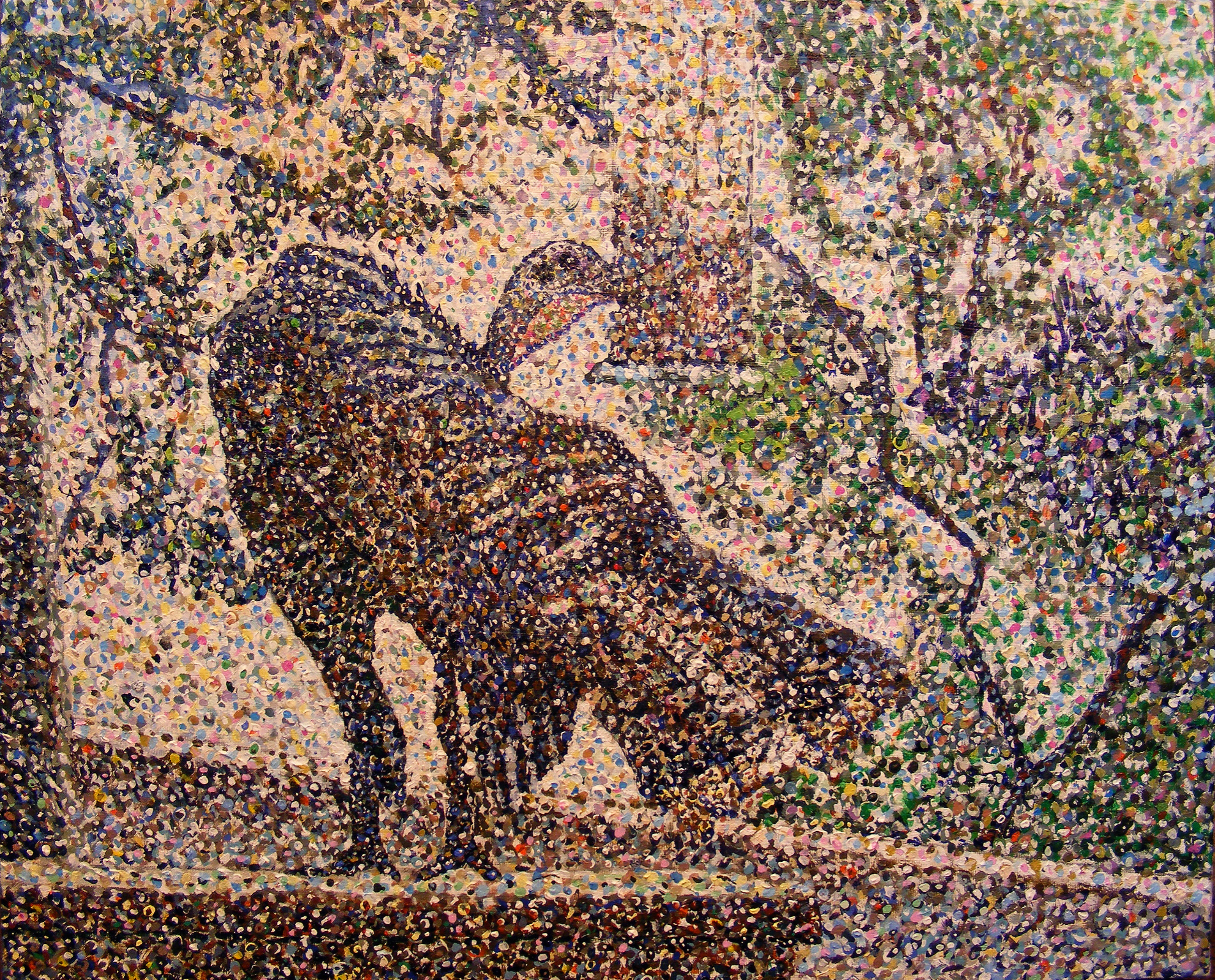
This photo of the painting was taken 17 hours into the painting process, you can see there is much more variation of the tone of the painting taking effect and it is starting to look a bit more like a completed painting. I worked a lot on the head of the Turkey at this stage as well as the feathers on the bird’s back. I also added some more detail to the bird feeder. You can see at this stage that there are a lot of rich dark shades on the railing that the Turkey is standing on. There is still a lot of work ahead at this point. The branches of the background trees look very bad at this point, but the foliage in the trees is starting to look more lively.
Here is a photo of the painting taken 21 hours into the painting process. I added a lot of mucky greens and browns in the painting, and I brought out some more levels of tone. Despite the mucky look, this painting took on at this stage.
One major area of focus at this stage of the painting is that I brought out a lot more detail in the bird by adding lighter tones to the dark areas. I also created a lighter tone of colour on the birds tail.
I also did add a lot more primaries, yellows, magentas and cerulean blues in the background.
I worked some more on the tree on the left. I brought out more character by adding Burnt Sienna, and Cerulean Blue (hue) to the branches. I also added some more Lemon Yellow to the Spruce Tree on the left-hand side to give this painting more impression of light.
Some of the other colours I used in this stage include Chrome Oxide Green, Cerulean Blue, Real, Ultra Marine Blue and Lemon Yellow.
Here is a photo of the painting taken 27 hours into the painting, although this is not a perfect photo with a magenta cast in the light you can see that I added a lot more detail.
I filled in more detail on the bird’s feathers. The 2 dominant colours that I used at this stage include Ultra Marine Blue, Cerulean Blue (Real) Burnt Umber and Burnt Sienna.
One area of focus for me at this stage of the painting was on the Bird Feeder and bringing out the contrast with the tree on the right by adding lighter tones of greens and yellows. I also worked some more on the railings of the deck by adding some Golden Orange and Burnt Sienna.
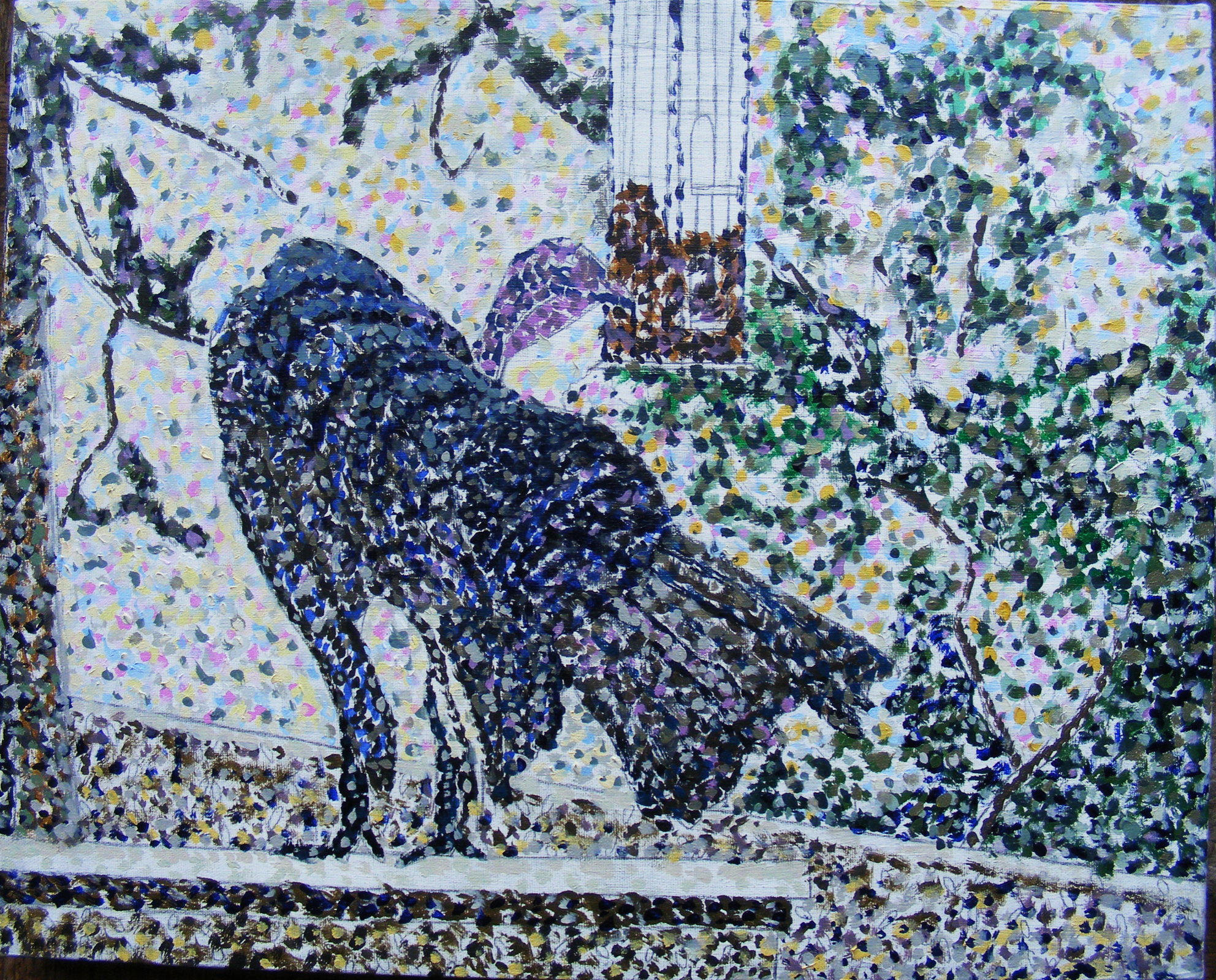
Here is the photo of the finished painting. You can see at this stage, I brought out a lot more detail, and the texture of the bird and its feathers. I also added more detail to the Bird Feeder and built some more on the leaf texture in the background.
There is less of a colour cast in the image and I was able to get a very good final photograph of the Turkey.
I really like how this painting turned out and to be fair I think this is the highest quality pointillism painting I have ever created. There are many subtle variations in colour and tone and it was created to a very high standard.
I submitted this painting to a Juried Art Show in Cornwall, ON and I won an honourable mention. I was not expecting this since I chose such a challenging subject matter in this painting. A Turkey is a lot harder to reproduce in pointillism than it is to paint a fuzzy landscape. There are simply so many proportions, textures etc. with a bird that is really hard to reproduce with this technique.

There’s so much work and attention in this painting, well done x
LikeLike
Congratulations on your award Shawn.
LikeLike