
Here are some paintings and Drawings I created using selective colours. For This Exercise, I used Paynes Grey, and Burnt Sienna, as well as Quinacridone Magenta and Sap Green. For the Quinacridone Magenta/ Sap Green, drawings, I had to substitute some of the colours because I did not have Quinacridone Magenta in Watercolour or Sap Green, so I used Permanent Rose, and Phatlo Green, which are very similar.
For the 2 Acrylic Paintings, I chose 2 scenes from Glengarry County, in Ontario, Canada. The first one was of a beaver dam. and the second scene was of a hilly cross country ski trail. I included these pictures in the post. For the other drawings, I also used local landscape scenes but did not include the photos.
Here is the artwork.

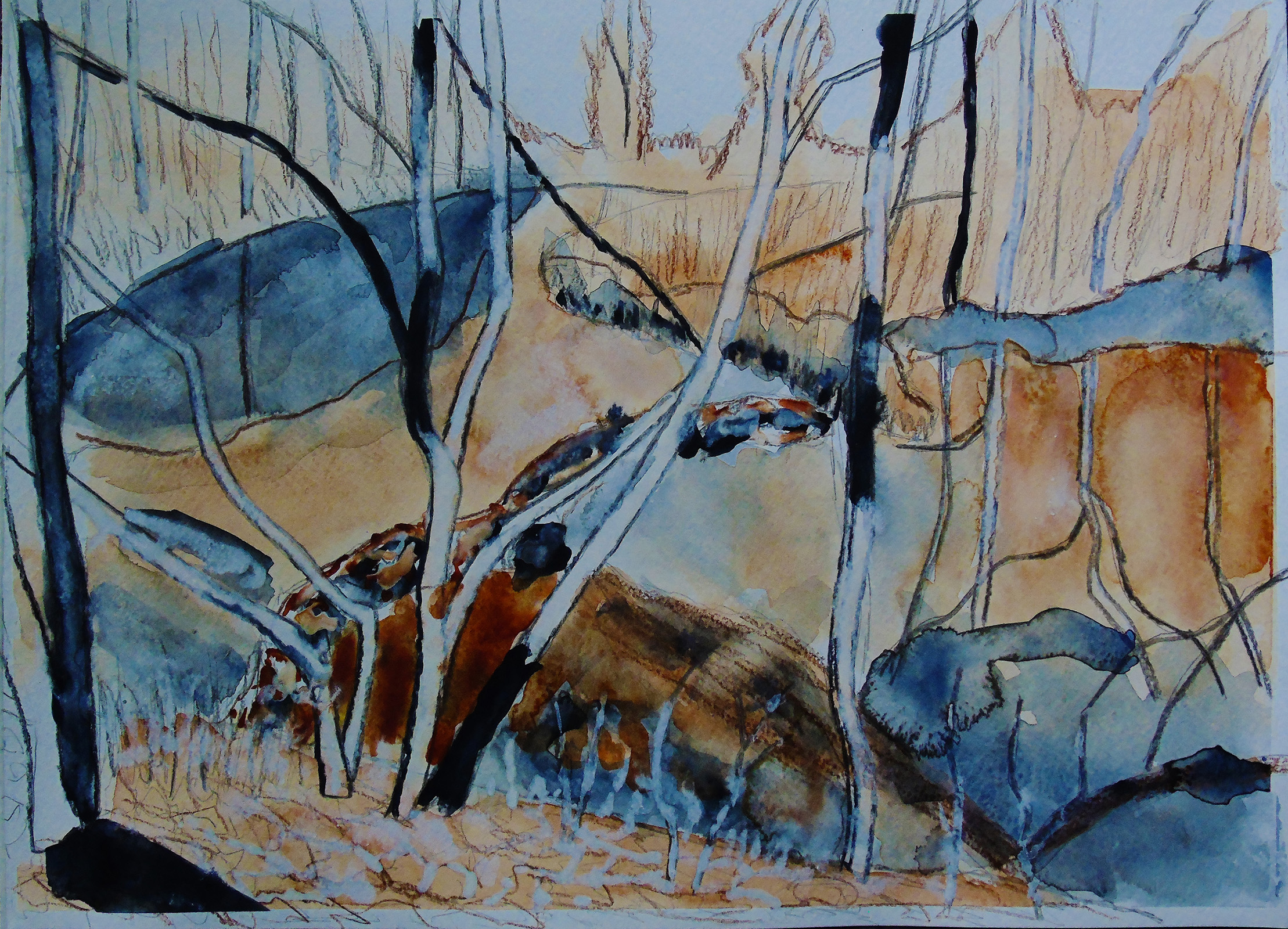
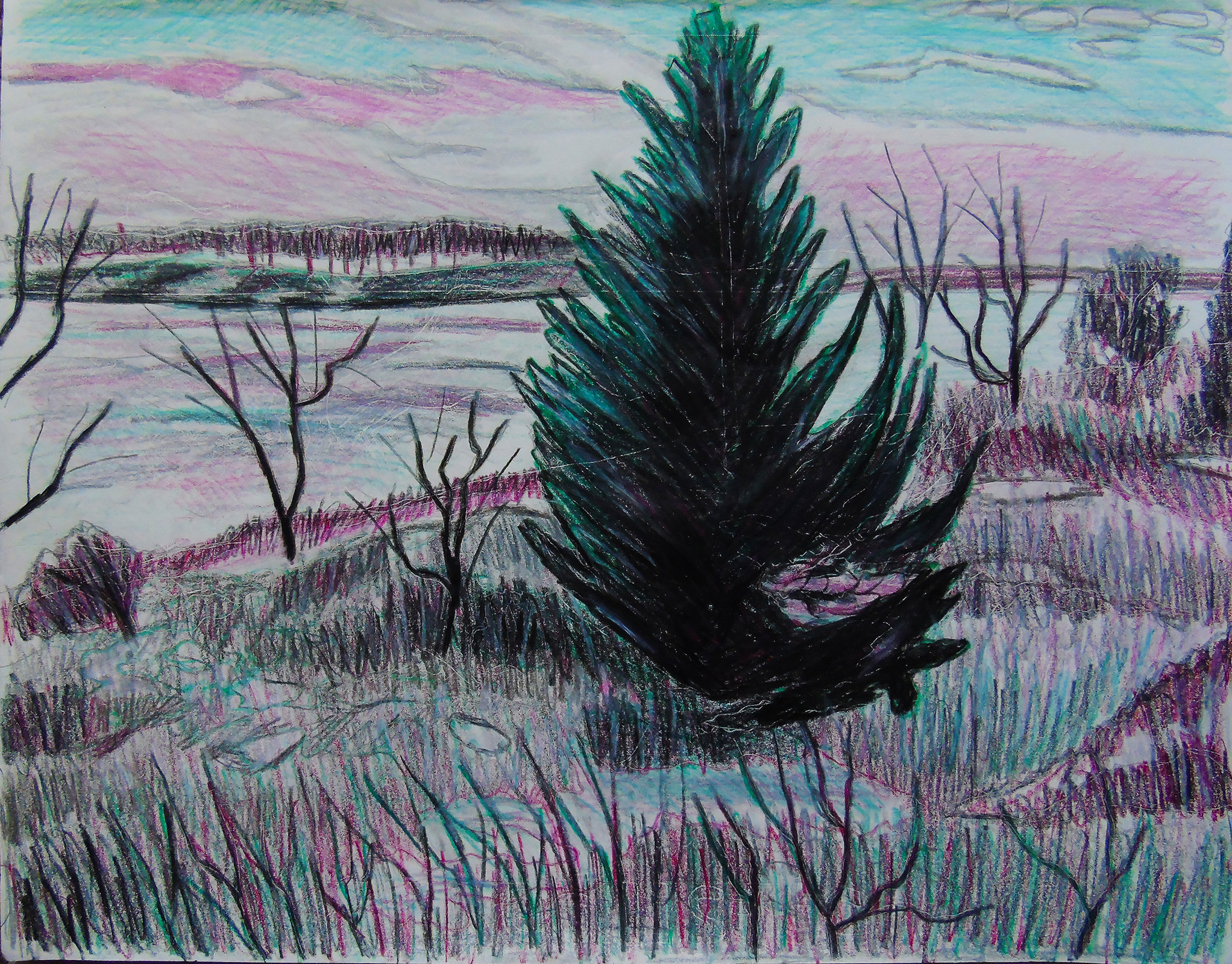
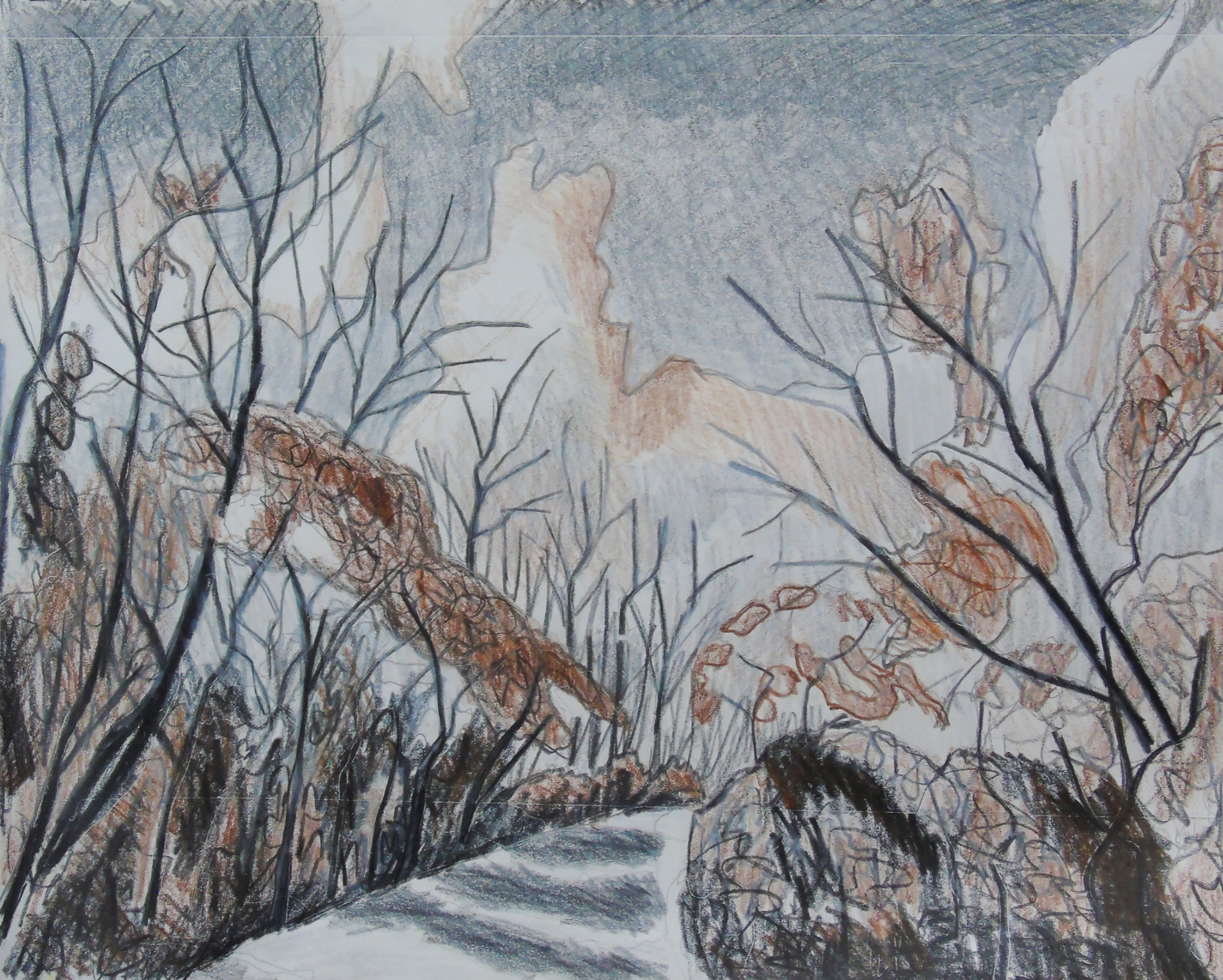
For the first scene, I chose a photo I took while cross country skiing at the Summerstown Trails in Glengarry County
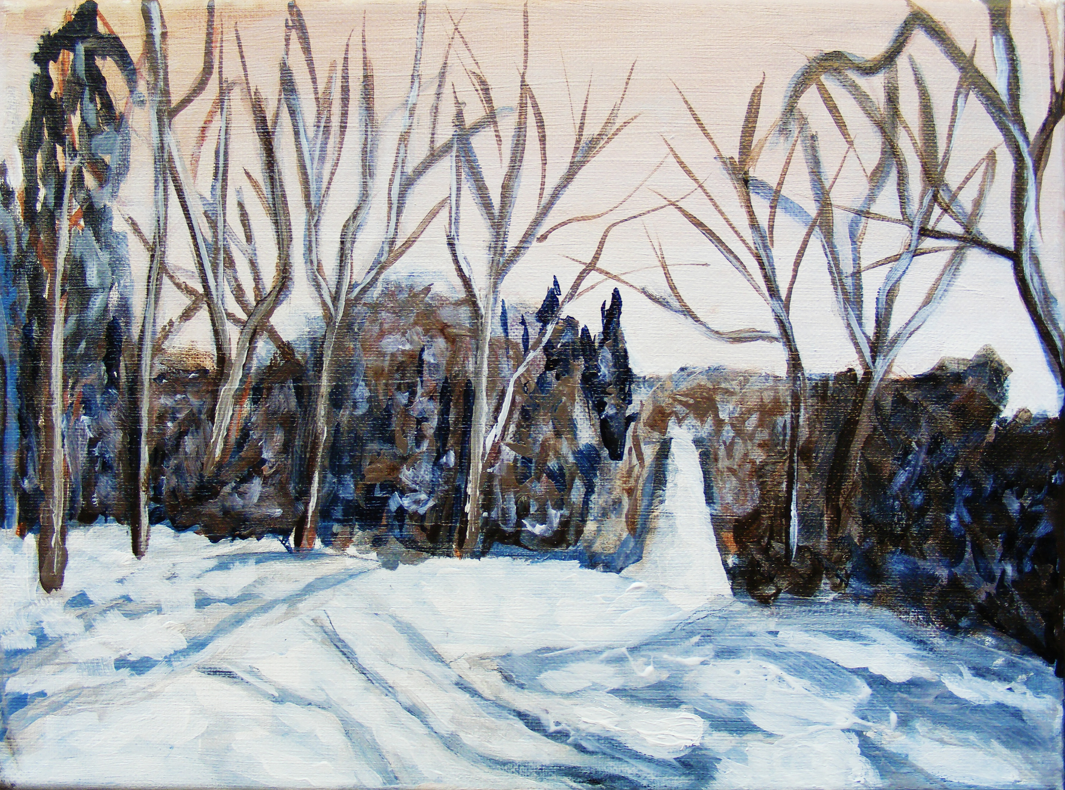
In the painting above, you can see I blocked in the hill, trees and sky. In this painting I used Burnt Sienna, Paynes Grey and Titanium White, this created a full tone of value with a limited colour palette.
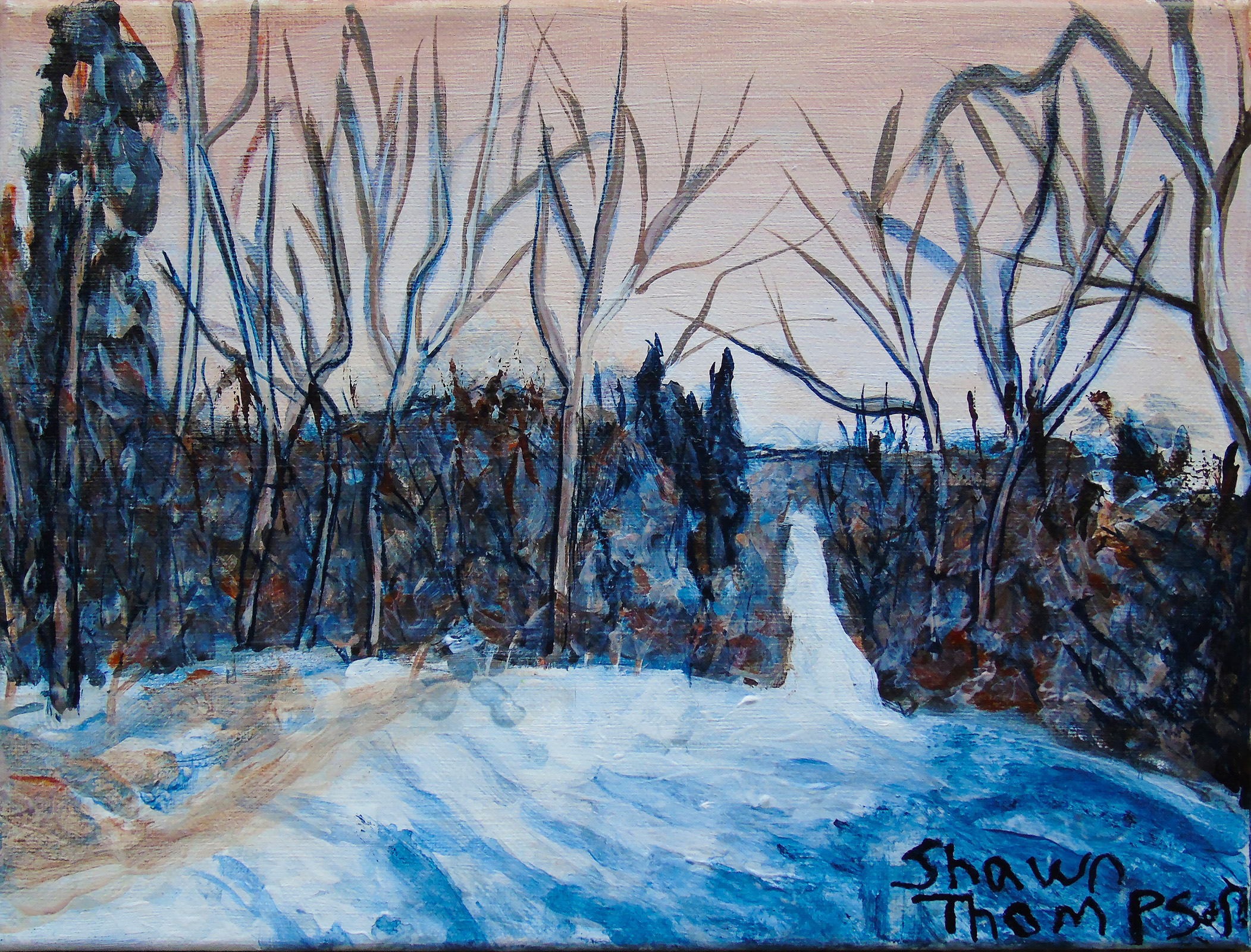
The painting above is the finished painting. Done after approximately 4 hours and 30 minutes. You can see that I added more tone to the cross country ski trail, and I made the trail narrower on the distant hill. I also added glazes of Burnt Sienna, Paynes Grey, and Titanium White on top to create more neutral tones. The last step was adding the signature.
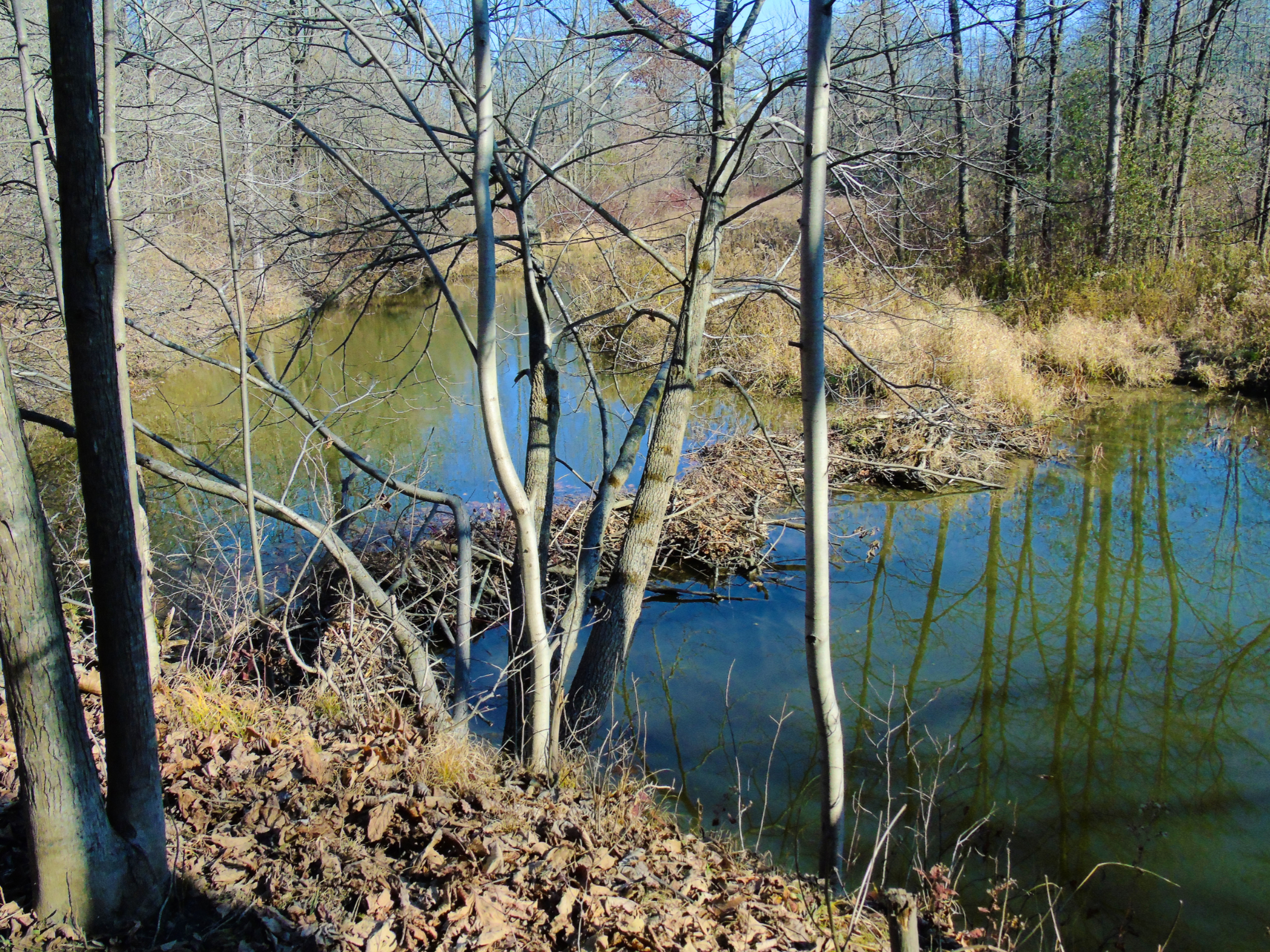
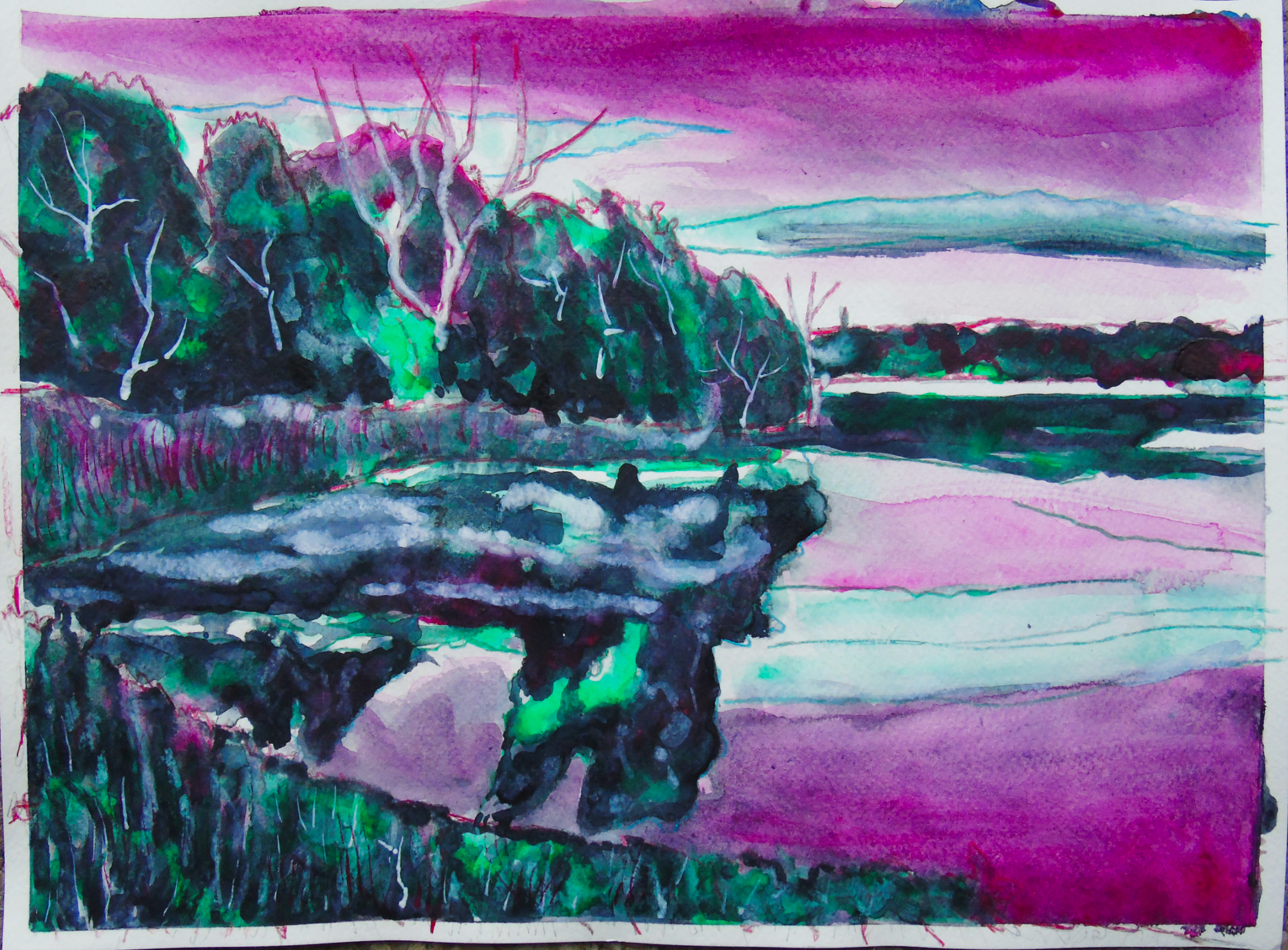
For the second scene, I chose a scene of a beaver dam crossing the creek at Greys Creek Conservation Area in Glengarry County.
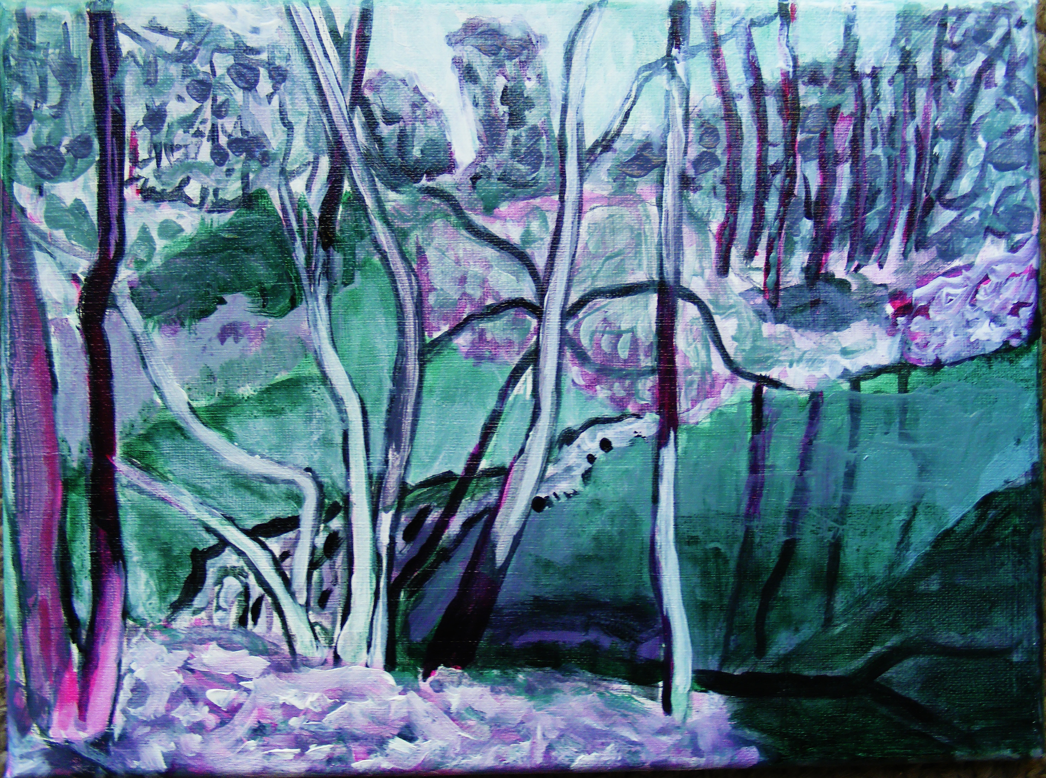
In the painting above, you can see that I neutralized 2 very bold colours Sap Green, and Quinacridone Magenta with Titanium White. Although the colours are not crazy bright because they’ve been mixed so much, they still provide very flavourful undertones, and in some of the brighter areas, you can see bold pops of colour.
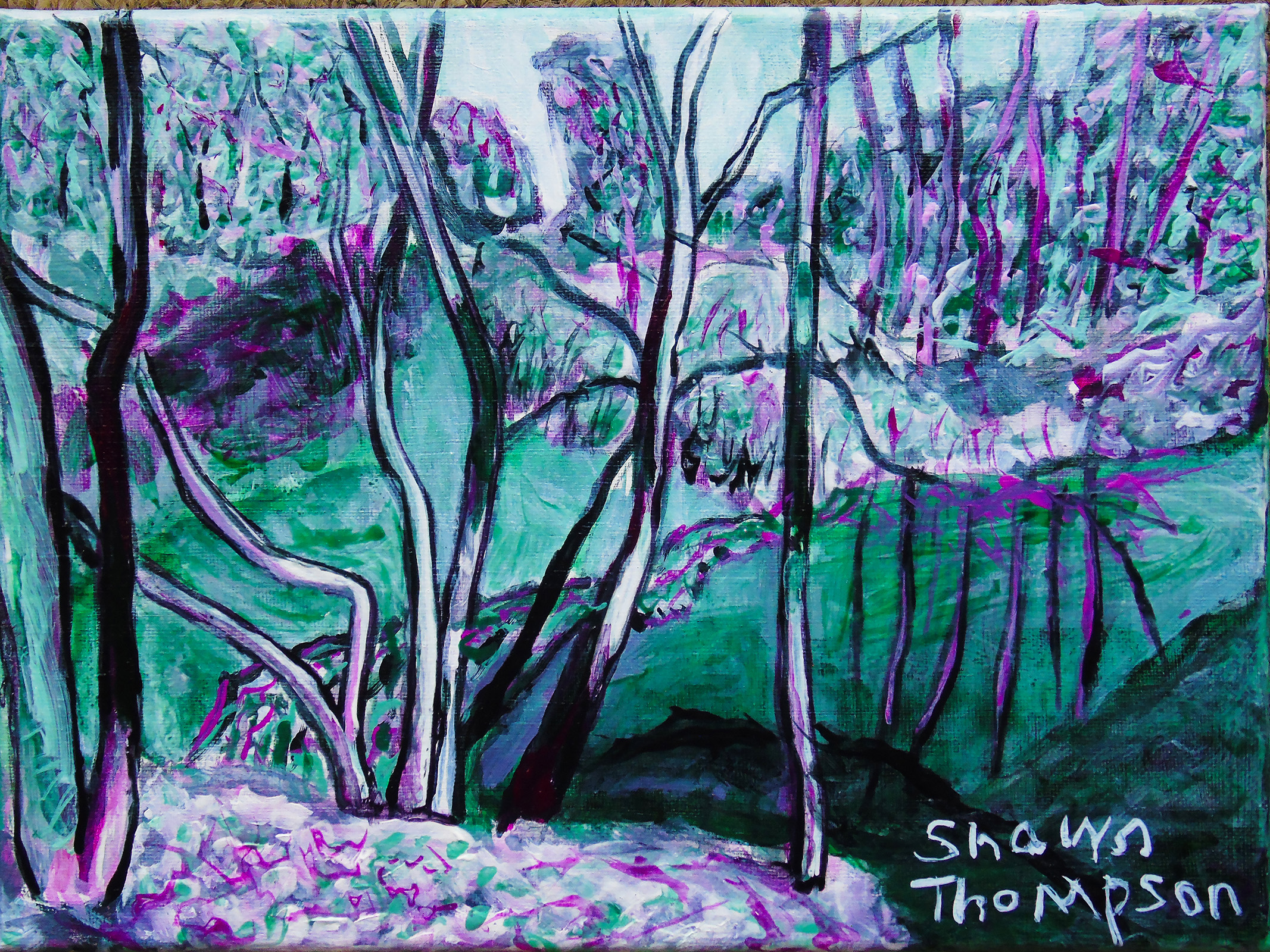
The painting above is the finished painting, done after approximately 4 hours and 30 minutes. You can see that in the finished painting, I increased the contrast of the trees and creek. I also improved the reflections in the water. I still didn’t mix my colours too bright and there are nice Magenta and Green undertones.
The images below are watercolour paintings and polycromos coloured drawings using similar

I especially like the ski trail image. You captured the wintry feeling.
LikeLike
Nice paintings, I really like the pink undertones x
LikeLike
Some of my favorite colors at work. Paynes Gray and Sap Green are often on my palette.
LikeLike